|
Practricia Tobin
|
Carson Fox
|
|
|
|
|
I chose the photographer Patricia Tobin. She was born in 1994 and is now 24. She grew up in Southwold, Suffolk and graduated with a BA photography degree at Nottingham Trent University in England. Tobin has a very witty personality like me. She is a very original artist and is very intelligent. Patricia takes all types of photos but her main focus is food photography and still lifes.
The style of Patricia Tobins work is very diverse. Most of her photos include contrast and bright colors. She has a very god eye on things, meaning that I the way she takes photos is very unique. Her photos that I decided to recreate have vibrant colors that contrast with each other. The photos are not the traditional food photography, Tobins intention was to make these photos exclusive in the way that this type of photography is not popular.
Tobins work was meant to make people “think about food in a no-literal way”. These photos connect to her on a personal level because she has a very bright personality. The photos are meant to be a funny way of seeing things and not be traditional. Patricia also has a comical personality, hence the puns in all the photos. She loves color and had the big sheets of paper lying around so decided to make something out of it.
I love the style of Patricia's photography, it inspired me to find new ways to make people see my photos and experiment more with the way I take photos. She made people look at food photography differently and I wanted to do that with all photos I took subsequently of viewing her work. In my work I normally like to take less vibrant photos a Tobin opened my eyes on how much better my work could be if I expanded my horizons with use of different more vibrant colors. She helped me become a better photographer by teaching me different ways of photography. She introduced me to these different types of photography with her work.
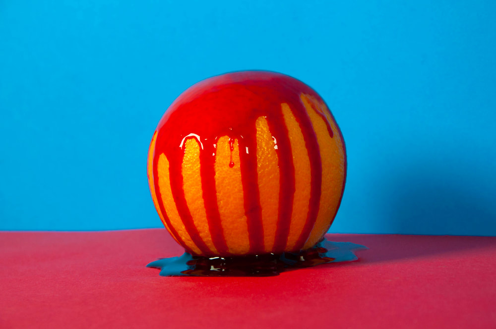
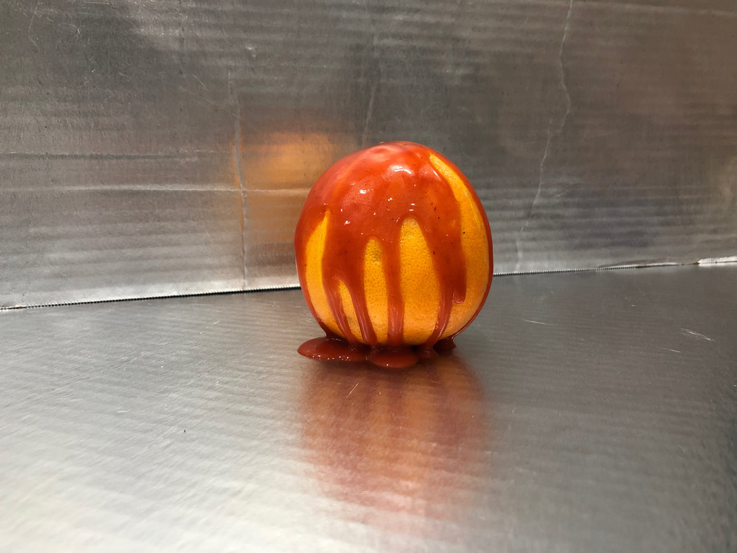
I think my first image of the orange is pretty similar to Patricia’s. My orange is smaller than hers and there is less sauce on mine. The backgrounds are clearly different because I didn’t have colored cardboard. I chose to do shiny cardboard because I thought it would look cool. I think Tobin draws in the point of interest a little better than me and has more contrast with the bright colors. I think the meaning is that there is a different way to see food. You wouldn’t normally eat an orange with sauce on it, would you? I like her photo much more than mine but I think they are pretty similar. I would not hang my photo up anywhere in my home because I do not like how it looks.
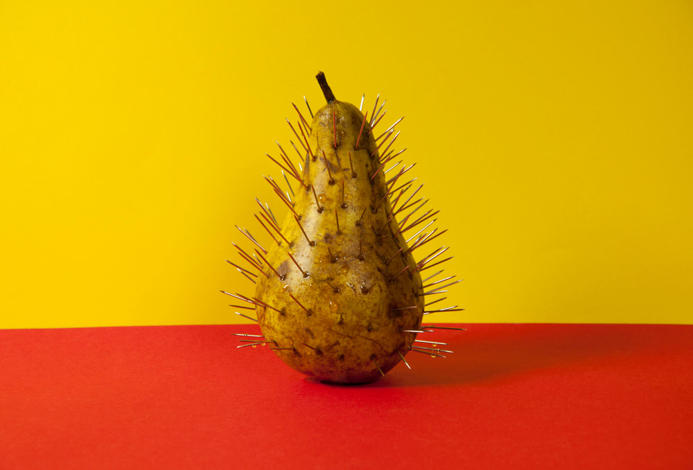
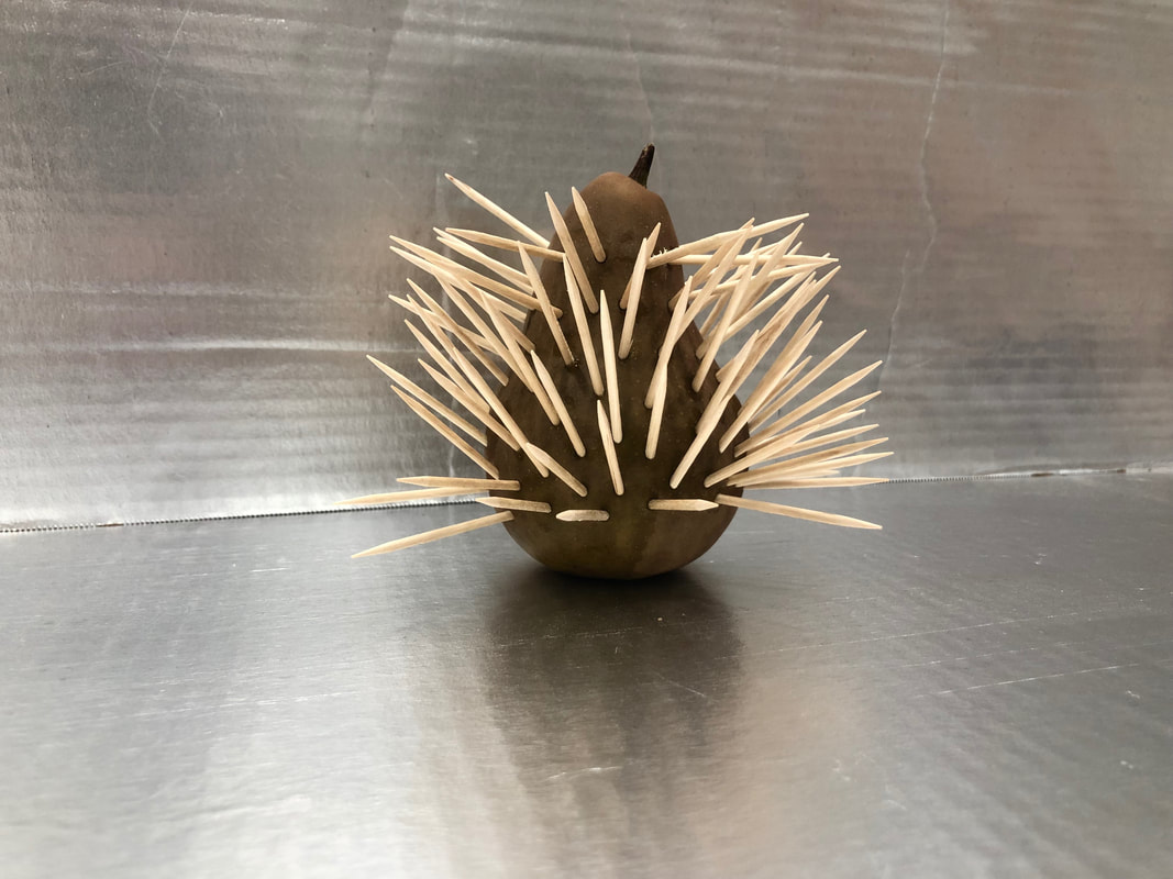
The second image has a pear with a bunch of toothpicks sticking out of it. It looks like something I would not want to touch or eat. I don’t think the images look that different besides the fact that my pear is much smaller than hers and toothpicks much larger than Patricia’s. Her photo has a little more vibrance than mine with the color of the pear being brighter and the backgrounds being colorful. This artwork is supposed to make you not want to eat this food and think of it as a bad thing. The toothpicks are keeping you away from eating the pear. I think her image looks better than mine but only by a little. The balance in Tobins photograph is better than mine. I still like both photos.
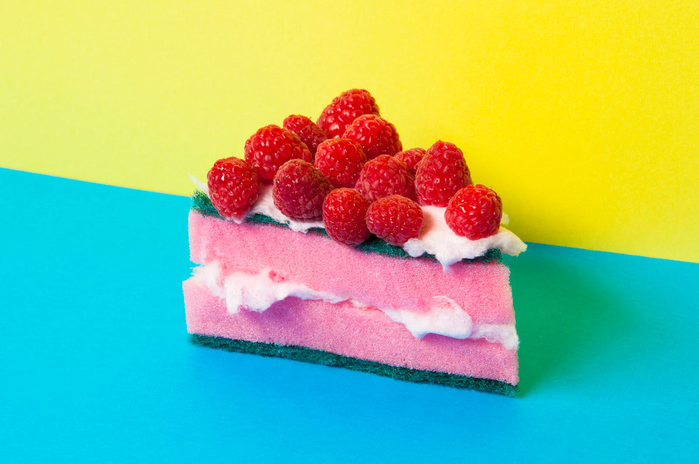
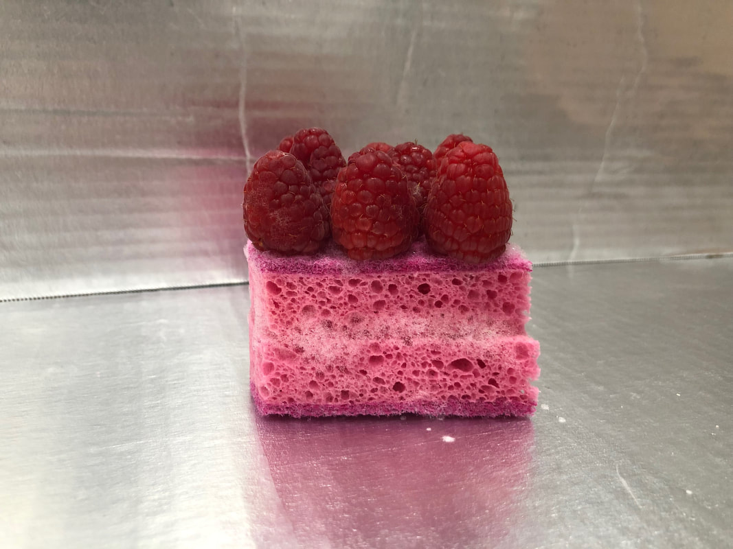
The third image is a sponge with soap in it. It is cut in half and stacked on itself. Strawberries are set on top of the sponge. In Patricia’s picture there are many colors being used while in mine only a few all of the same shade. This photo looks like it is supposed to be a type of pie or cake. I don’t think it is supposed to look appealing and actually trick the viewer into thinking they want it at first but then realizing that they don’t. I like both images and out of the three ones I took myself this is my favorite.
In my three images I used shape, because of the shapes of the different still lies I took, line, because of the outline of the shapes. I like all of her photos more than mine. I think she used contrast much better than I did and had a much better balance than me. I took these photos in my kitchen with this shiny cardboard I found in my garage. I went to the store to by all the items I knew I would need and did my best to recreate the photos. I had my mom hold up the back board for the backdrop and set the bottom board on the counter. These photos were hard for me to recreate because I wasn’t sure exactly what she used on top of the orange and how she got the bubbles to look like that on the sponge. Overall I think I did good for my circumstances and am proud of my project.
The style of Patricia Tobins work is very diverse. Most of her photos include contrast and bright colors. She has a very god eye on things, meaning that I the way she takes photos is very unique. Her photos that I decided to recreate have vibrant colors that contrast with each other. The photos are not the traditional food photography, Tobins intention was to make these photos exclusive in the way that this type of photography is not popular.
Tobins work was meant to make people “think about food in a no-literal way”. These photos connect to her on a personal level because she has a very bright personality. The photos are meant to be a funny way of seeing things and not be traditional. Patricia also has a comical personality, hence the puns in all the photos. She loves color and had the big sheets of paper lying around so decided to make something out of it.
I love the style of Patricia's photography, it inspired me to find new ways to make people see my photos and experiment more with the way I take photos. She made people look at food photography differently and I wanted to do that with all photos I took subsequently of viewing her work. In my work I normally like to take less vibrant photos a Tobin opened my eyes on how much better my work could be if I expanded my horizons with use of different more vibrant colors. She helped me become a better photographer by teaching me different ways of photography. She introduced me to these different types of photography with her work.
I think my first image of the orange is pretty similar to Patricia’s. My orange is smaller than hers and there is less sauce on mine. The backgrounds are clearly different because I didn’t have colored cardboard. I chose to do shiny cardboard because I thought it would look cool. I think Tobin draws in the point of interest a little better than me and has more contrast with the bright colors. I think the meaning is that there is a different way to see food. You wouldn’t normally eat an orange with sauce on it, would you? I like her photo much more than mine but I think they are pretty similar. I would not hang my photo up anywhere in my home because I do not like how it looks.
The second image has a pear with a bunch of toothpicks sticking out of it. It looks like something I would not want to touch or eat. I don’t think the images look that different besides the fact that my pear is much smaller than hers and toothpicks much larger than Patricia’s. Her photo has a little more vibrance than mine with the color of the pear being brighter and the backgrounds being colorful. This artwork is supposed to make you not want to eat this food and think of it as a bad thing. The toothpicks are keeping you away from eating the pear. I think her image looks better than mine but only by a little. The balance in Tobins photograph is better than mine. I still like both photos.
The third image is a sponge with soap in it. It is cut in half and stacked on itself. Strawberries are set on top of the sponge. In Patricia’s picture there are many colors being used while in mine only a few all of the same shade. This photo looks like it is supposed to be a type of pie or cake. I don’t think it is supposed to look appealing and actually trick the viewer into thinking they want it at first but then realizing that they don’t. I like both images and out of the three ones I took myself this is my favorite.
In my three images I used shape, because of the shapes of the different still lies I took, line, because of the outline of the shapes. I like all of her photos more than mine. I think she used contrast much better than I did and had a much better balance than me. I took these photos in my kitchen with this shiny cardboard I found in my garage. I went to the store to by all the items I knew I would need and did my best to recreate the photos. I had my mom hold up the back board for the backdrop and set the bottom board on the counter. These photos were hard for me to recreate because I wasn’t sure exactly what she used on top of the orange and how she got the bubbles to look like that on the sponge. Overall I think I did good for my circumstances and am proud of my project.
Sources:
